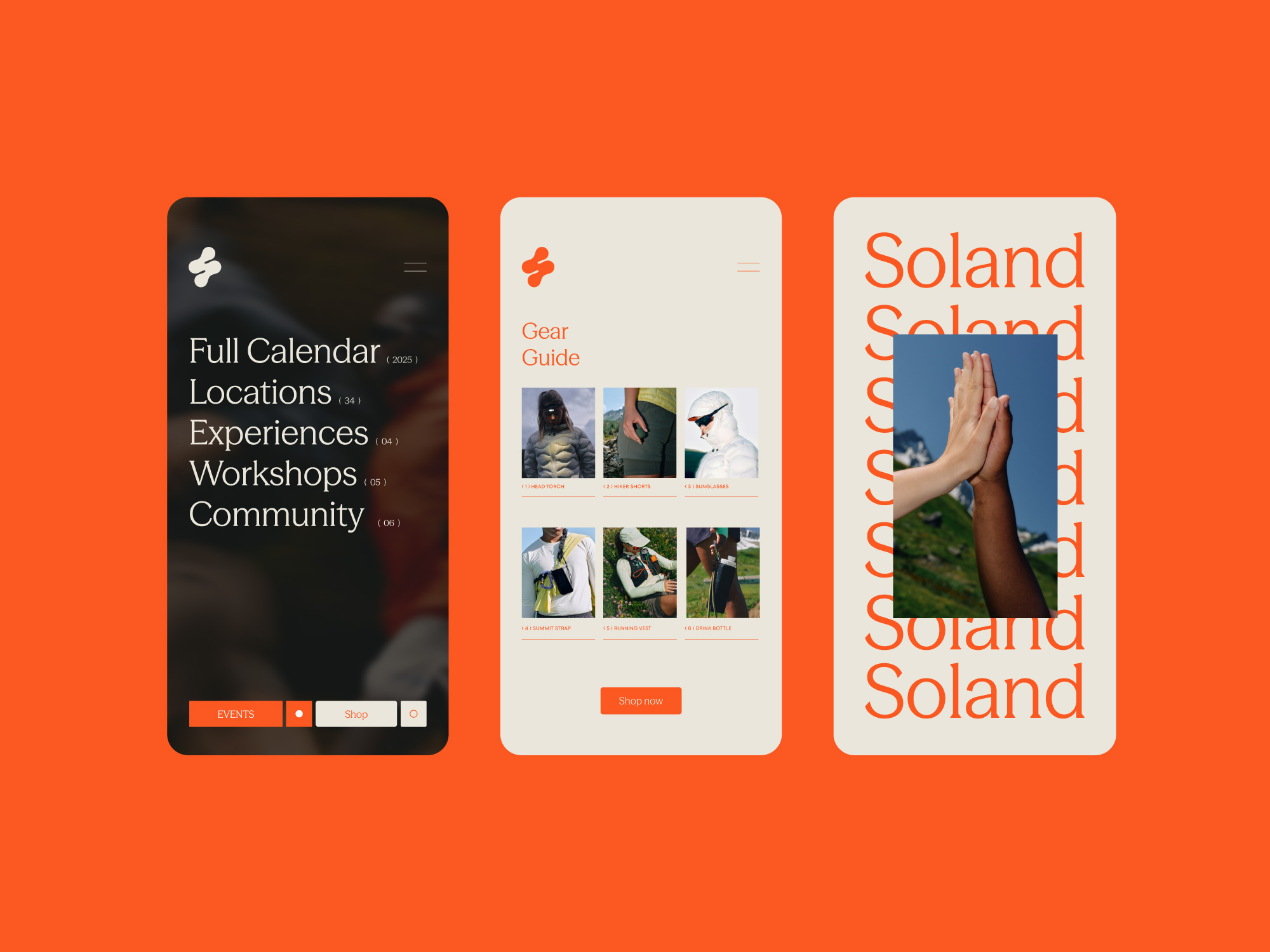
Soland
Case study

Project info
Soland is a conceptual brand exploring the intersection of trail running and community-led outdoor culture – made for the modern outdoor enthusiast. By blending the technical performance of trail gear with the aesthetics of contemporary streetwear, Soland bridges the gap between function and culture. The name combines Sol (sun/soul) and Land (earth/terrain), reflecting both the landscapes we move through and the inner journey of endurance and self-discovery. This philosophy is echoed in the logomark: two feet converging into an ‘S’, a symbol of duality in motion – resilience and community, grounding and momentum, nature and innovation.
Deliverables
Brand Identity
Creative Direction
Digital Design
Tone of Voice


No items found.